Personal work completed reimaging the money saving framework to reflect new realities.
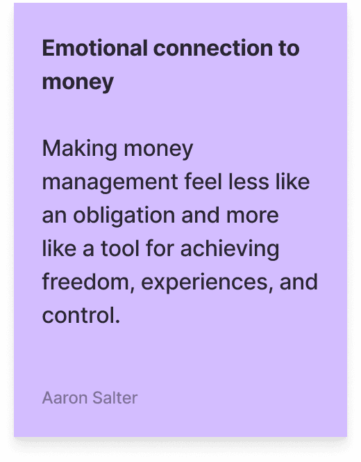
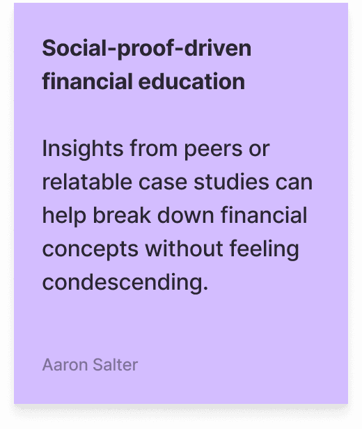
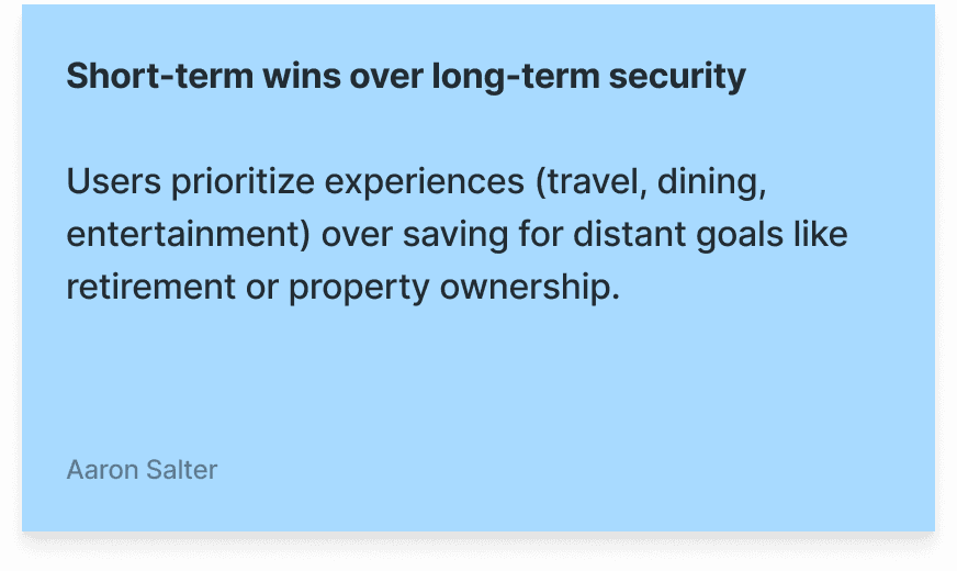
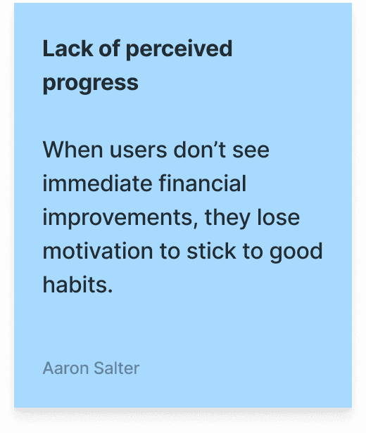
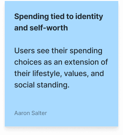
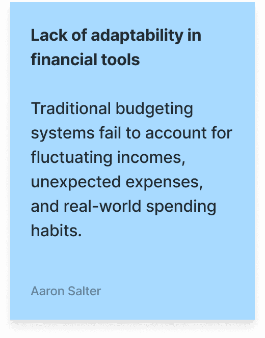
The concept for the 'Moneymath' app emerged from observing generational shifts in financial behaviors, particularly the tension between aspirational saving habits and the desire for guilt-free spending among millennials and Gen Z. Named after the viral trend of Girl and Boy 'math', it leverages principles of behavioral economics and gamification, aiming to reframe personal finance by prioritizing positive reinforcement over punitive budgeting and addressing the cognitive dissonance many users experience when balancing financial responsibility with lifestyle preferences.


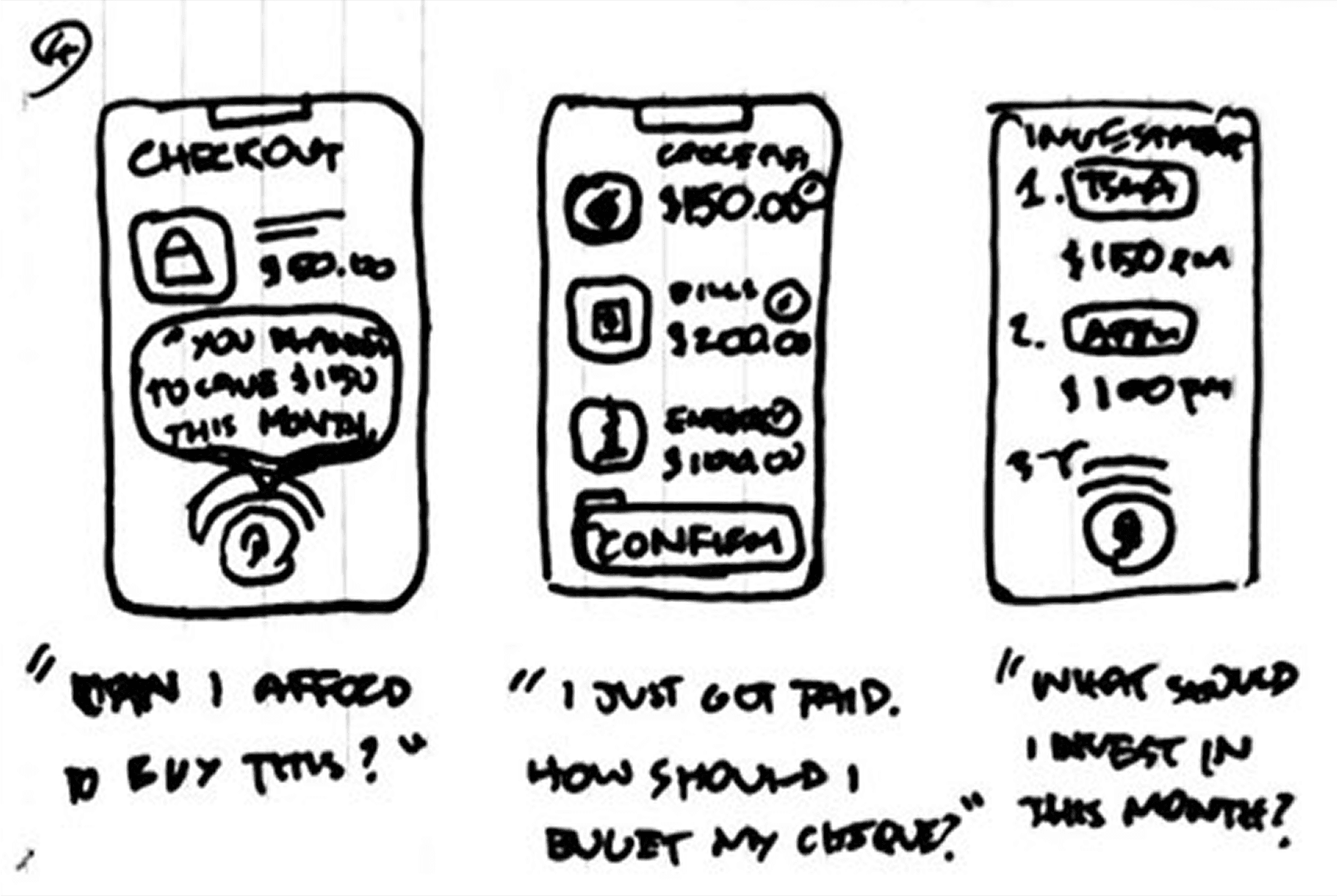
Crazy Eights
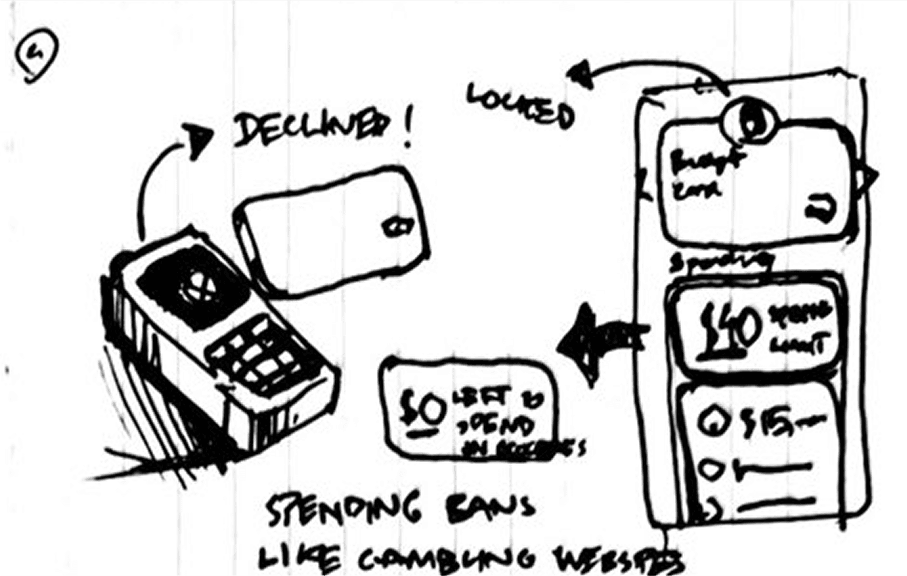
Using Crazy Eights helped rapidly generate and explore diverse ideas, pushing beyond obvious solutions. This fast-paced exercise encouraged creative problem-solving and uncovered unique approaches to user challenges. It provided a strong foundation for refining and iterating on the best concepts, which i followed into a digital crazy eights exercise to rapidly explore solutions.


User Flows
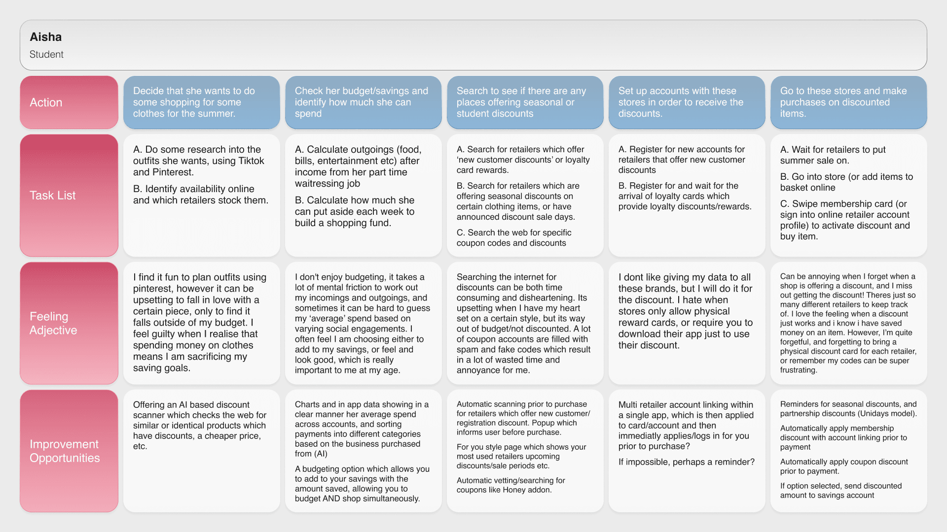
Mapping out user flows was crucial in shaping the design of moneymath, ensuring a seamless and intuitive experience. By visualizing each step users take, I identified friction points and optimized navigation, focusing on making complex financial saving concepts more accessible. This process helped streamline interactions, improve usability, and align the design with user needs.
Usability optimization
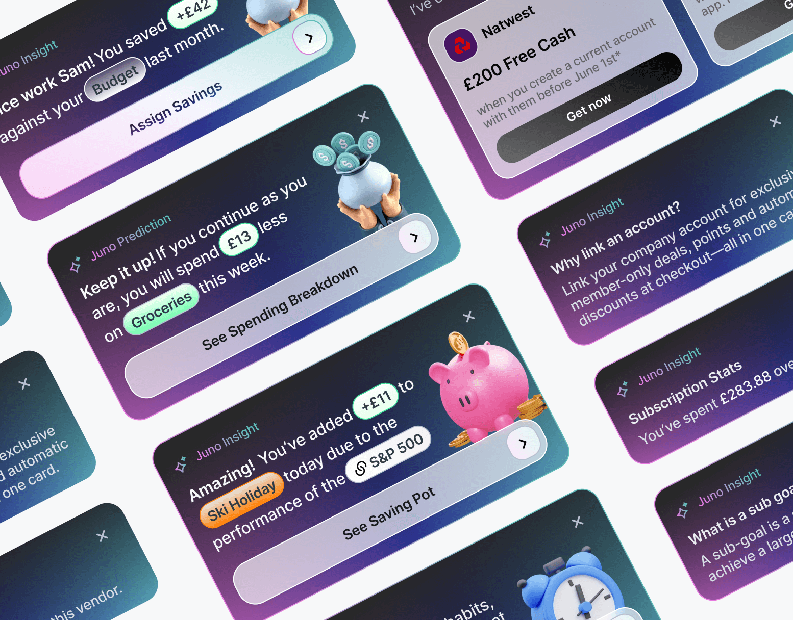
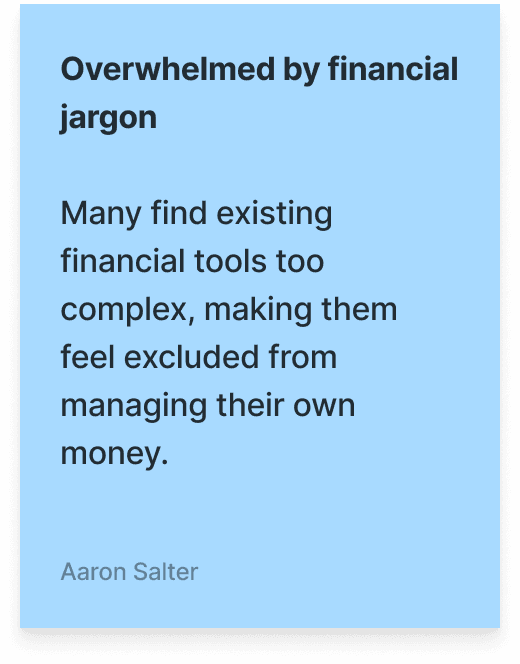
Crafting the information architecture for moneymath was essential in streamlining the budgeting experience, ensuring users quickly access the most relevant financial insights, rather than overloading them with pages. By implementing a clear hierarchical structure and prioritizing content discoverability, I minimized cognitive overload and enhanced wayfinding. Insights from user testing informed iterative refinements, optimizing the flow of information to support intuitive decision-making.
Cognitive load reduction

Iterative Prototyping

Wireframing solutions
Wireframing allowed me to prototype, test, and iterate on key interactions before final development. By visualizing layouts and user flows early, then testing them with users quickly I identified friction points—such as feature overload and complexity of data communication in financial apps —leading to a more efficient and accessible experience. This process also informed UI refinements, like optimizing the saving pots for quick glances by adjusting font hierarchy and spacing.
Early problem detection
Iterative refinement
User-driven improvements
Applying Learned Insights
Structured feedback sessions in Figma allowed for a systematic breakdown of usability pain points. Key issues were mapped using annotations and post-it insights, then distilled into high-impact takeaways. This process ensured that only the most critical UX improvements were implemented strategically.
Refined Navigation – Simplified flows based on friction points.
Clearer Financial Insights – Improved data hierarchy for faster decisions.
Streamlined Onboarding – Reduced steps for a smoother start.

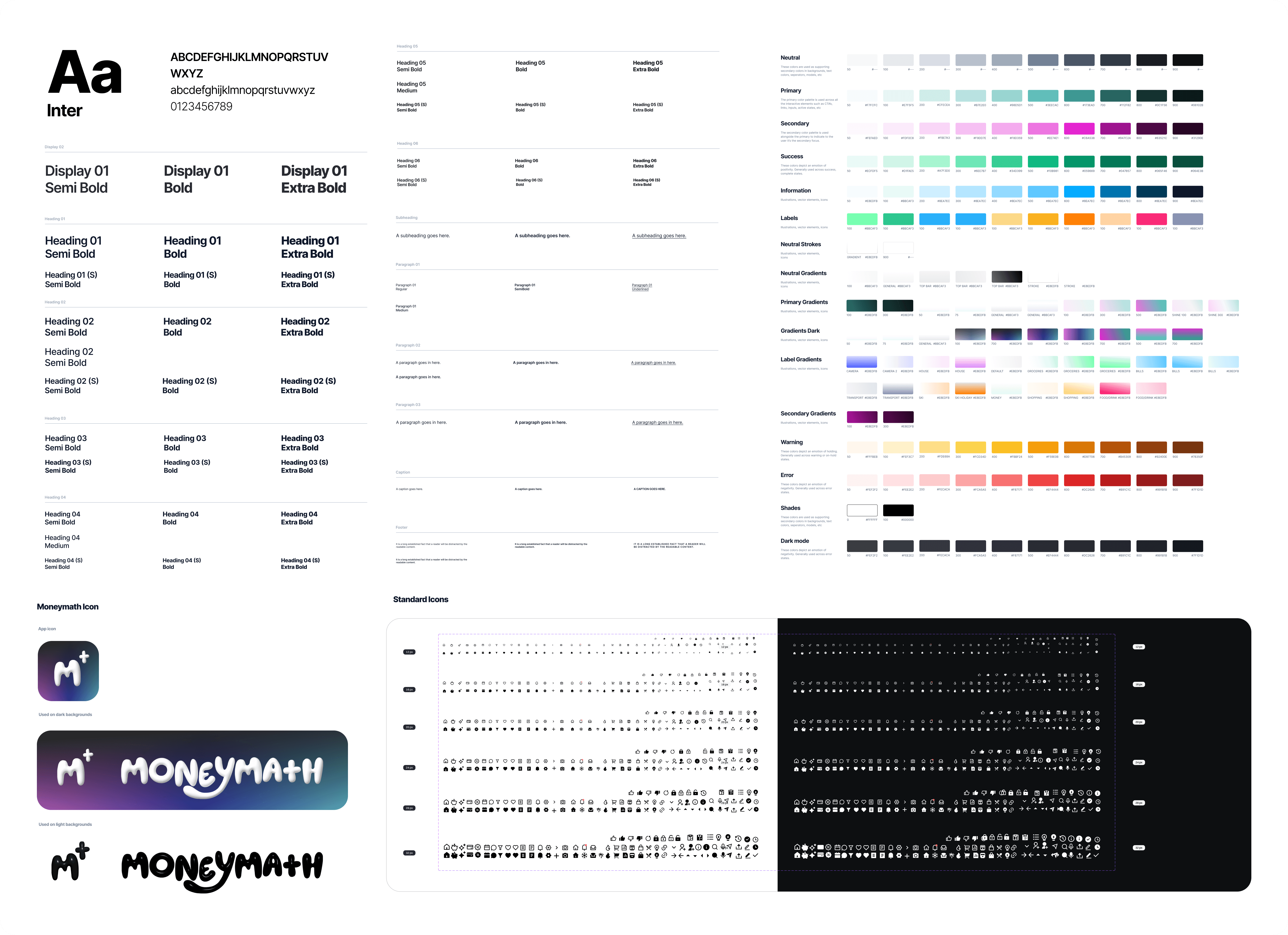
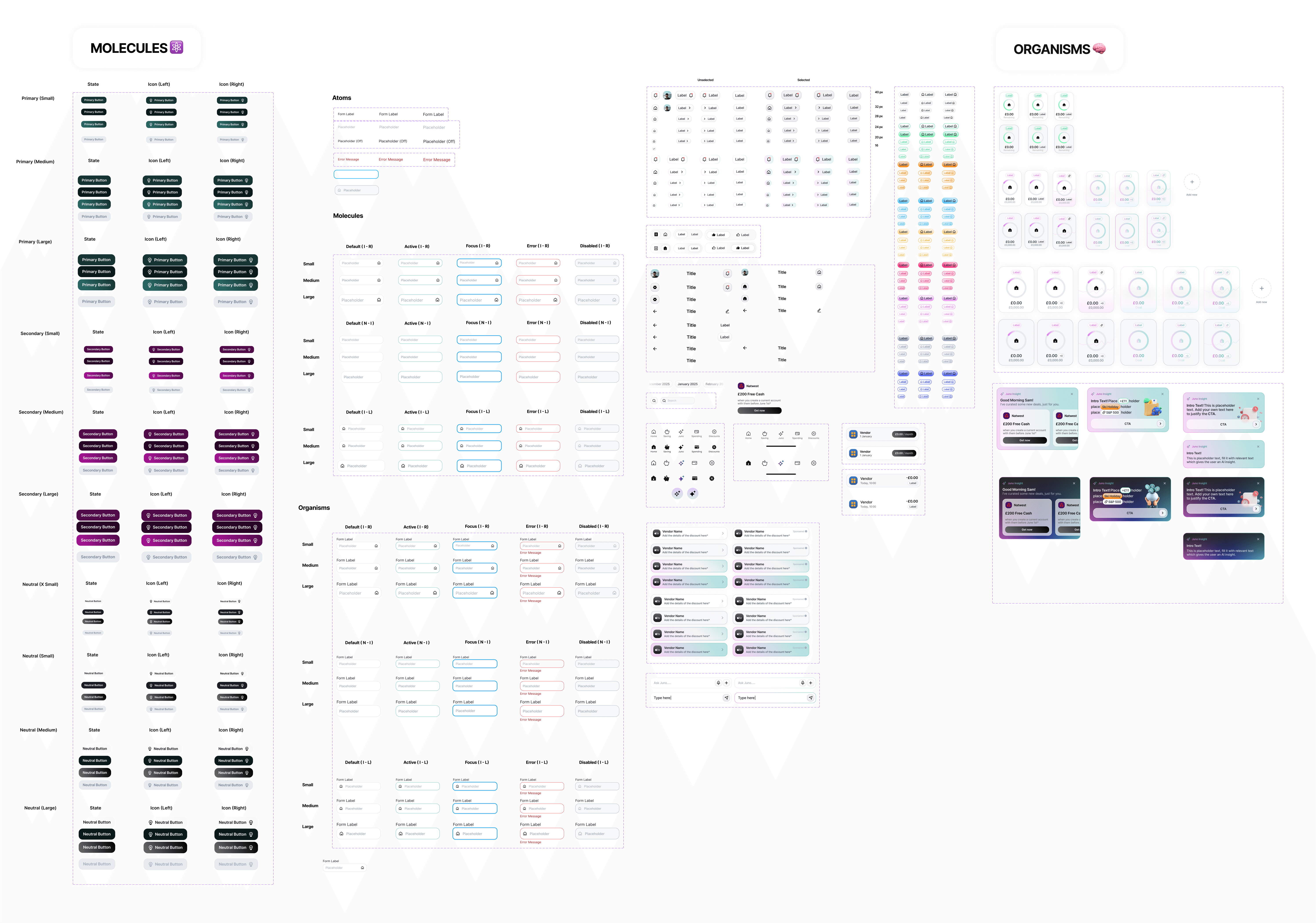
Atomic design system
Consistency – Standardized UI for visual cohesion.
Efficiency – Reusable components for faster iteration.
Scalability – A flexible foundation for future growth.
Visual Identity
Recognition – Distinctive visuals make brands memorable.
Trust – Consistency builds user confidence.
Cohesion – Unified design ensures seamless interactions.
Preview