
Work completed whilst at Boxclever for startup Irrigreen.
Irrigreen, a tech-forward startup revolutionizing irrigation with real-time sensors and digital controls, approached Boxclever to deliver a refined app experience to match its premium brand. Collaborating closely with the CEO, we established aspirational design targets, applied customer-driven insights, and developed a streamlined dashboard through iterative prototyping.
As a recent graduate, I was exposed to the entire design process and aided in user research, wireframing, and iterative prototyping to refine the app experience. I contributed to usability testing, helping to identify friction points and streamline interactions, and engaged in the development of the Irrigreen design system.

3.7/5
(18 reviews)
"The app leaves much to be desired from a user control standpoint."
User review, IOS App Store
"Setting up my zones was way harder than it should be."
User review, IOS App Store
"The app...doesn't allow you to accomplish simple tasks like changing order of zones."
User review, IOS App Store


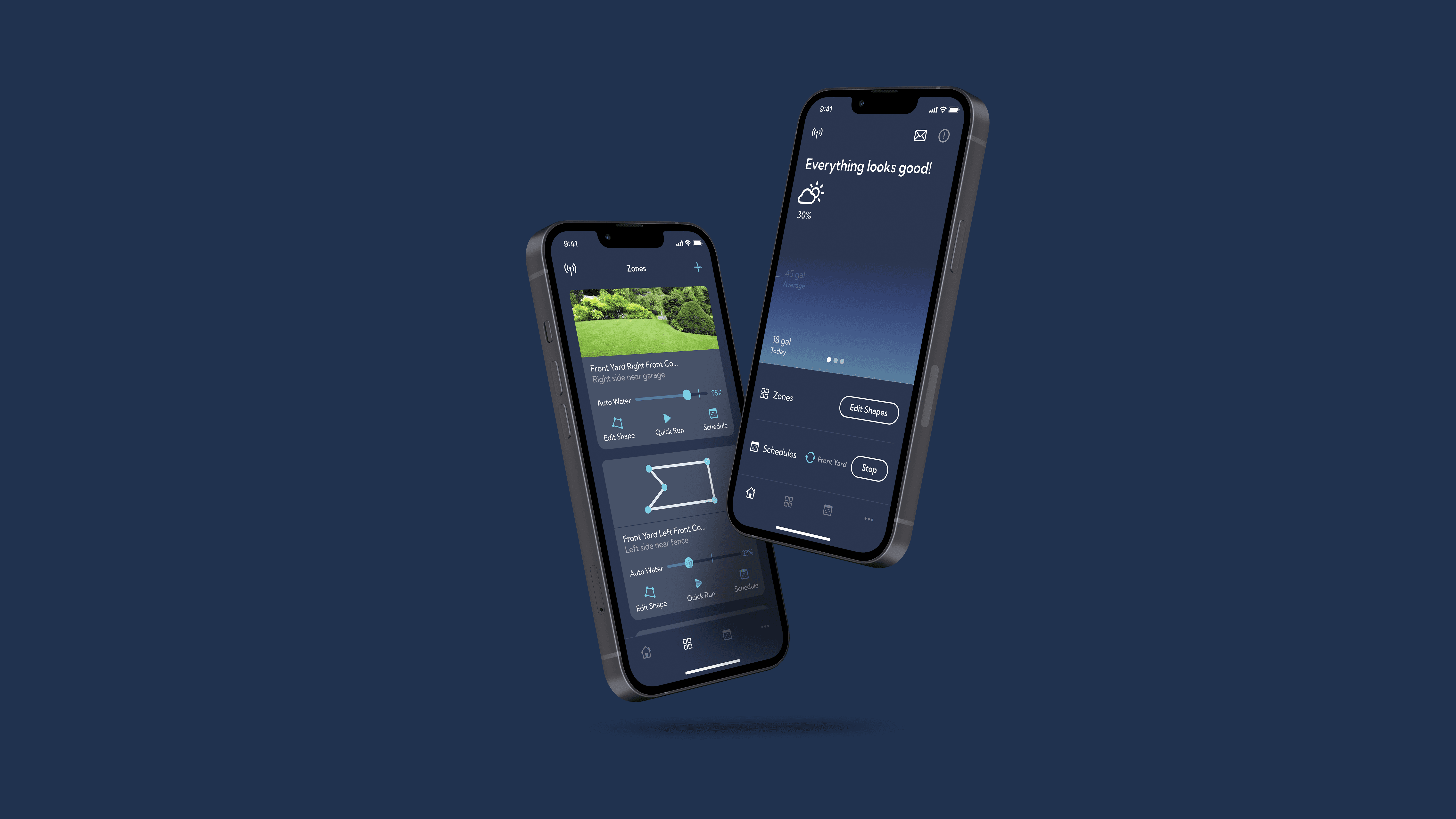
Comprehensive UX Overhaul
A full-scale redesign of the Irrigreen app refocused on optimizing the onboarding experience, streamlining user flows, and refining the interface to create a frictionless and intuitive interaction. By leveraging iterative prototyping, refined visual hierarchy, and data-driven insights, the update transforms complex tasks into simple, efficient actions that enhance user engagement.
Optimized Onboarding: A guided, step-by-step setup process that reduces friction and accelerates user activation.
Enhanced Interface & Navigation: A modern, clean UI with restructured information hierarchy to make key functions immediately accessible.
Intuitive user flow : Smart transitions and contextual feedback that enable seamless interactions, ensuring users complete tasks with confidence.


A comprehensive overhaul of the Irrigreen app's visual identity, enhancing user experience through a refined font system, updated iconography, and a harmonized color palette. This redesign aligns the app's aesthetics with Irrigreen's premium brand positioning.
Updated Font System: Improved readability and consistency across the app.
Refined Iconography: Clear and intuitive icons enhance user navigation.
Harmonized Color Palette: A cohesive color scheme that reflects the brand's modern identity.
Outcome
The redesign culminated in a seamlessly integrated digital experience that aligns Irrigreen’s premium brand identity with a user-first approach. The feedback from users was overwhelmingly positive, addressing many issues which had created friction for users and resulting in a significant increase in 4 and 5 star reviews across both IOS and Android app stores, as well as major publications.
3.7/5
(18 reviews)
4.2/5
(27 reviews)
"In early July, 2023 - I hopped on the app to do a manual EDIT SHAPE watering, and noticed everything had changed with the app & interface."
User, IOS App Store.
Key actions are now clearly surfaced, eliminating confusion.
"The new version of the app works! I am now able to edit the zone maps without issues."
User review, Google Play Store
"The app provides precise data on water usage during each session, enhancing transparency. "
Forbes Review